This quick animation was done through Adobe Photoshop using the Timeline Animation.
This Second Piece was done in Adobe Photoshop trying to replicate the intricate designs of a kaleidoscope.
Made in Adobe After Effects with the intentions of simulating a kaleidoscope.
Kaleidoscope is a hand made typeface created using the Bodoni Typeface and old fireplace tiles.
Process
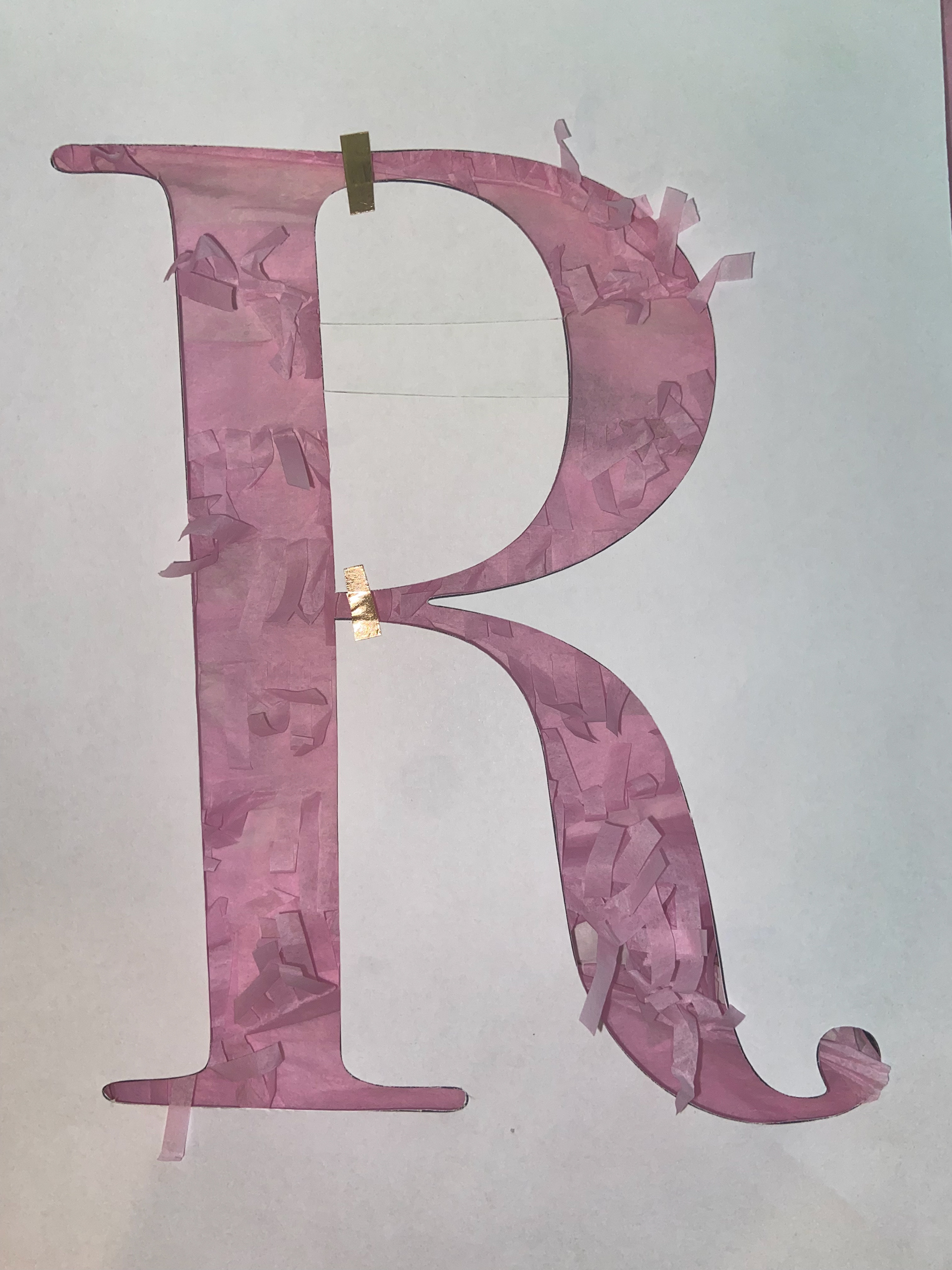
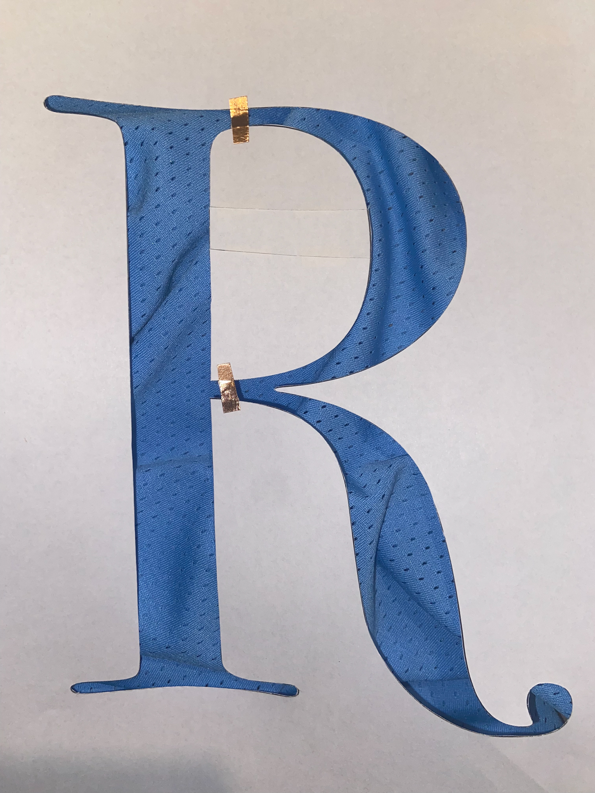
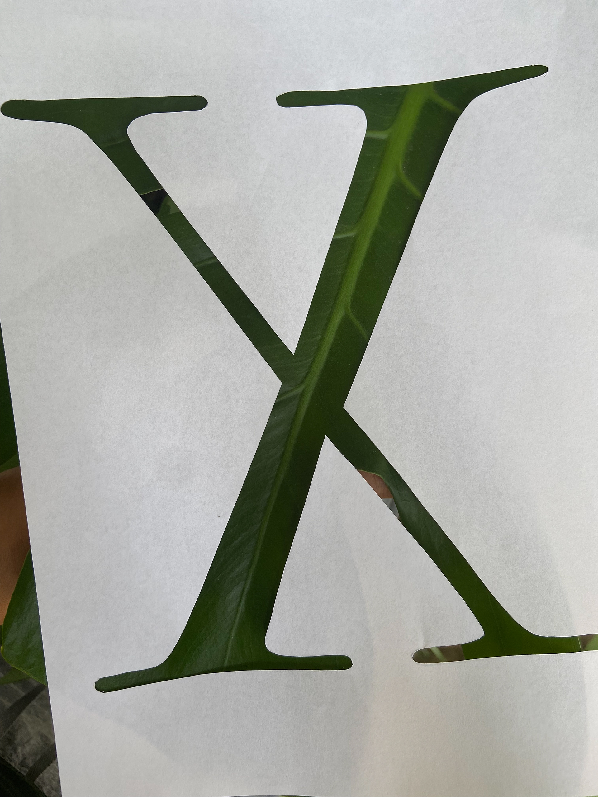
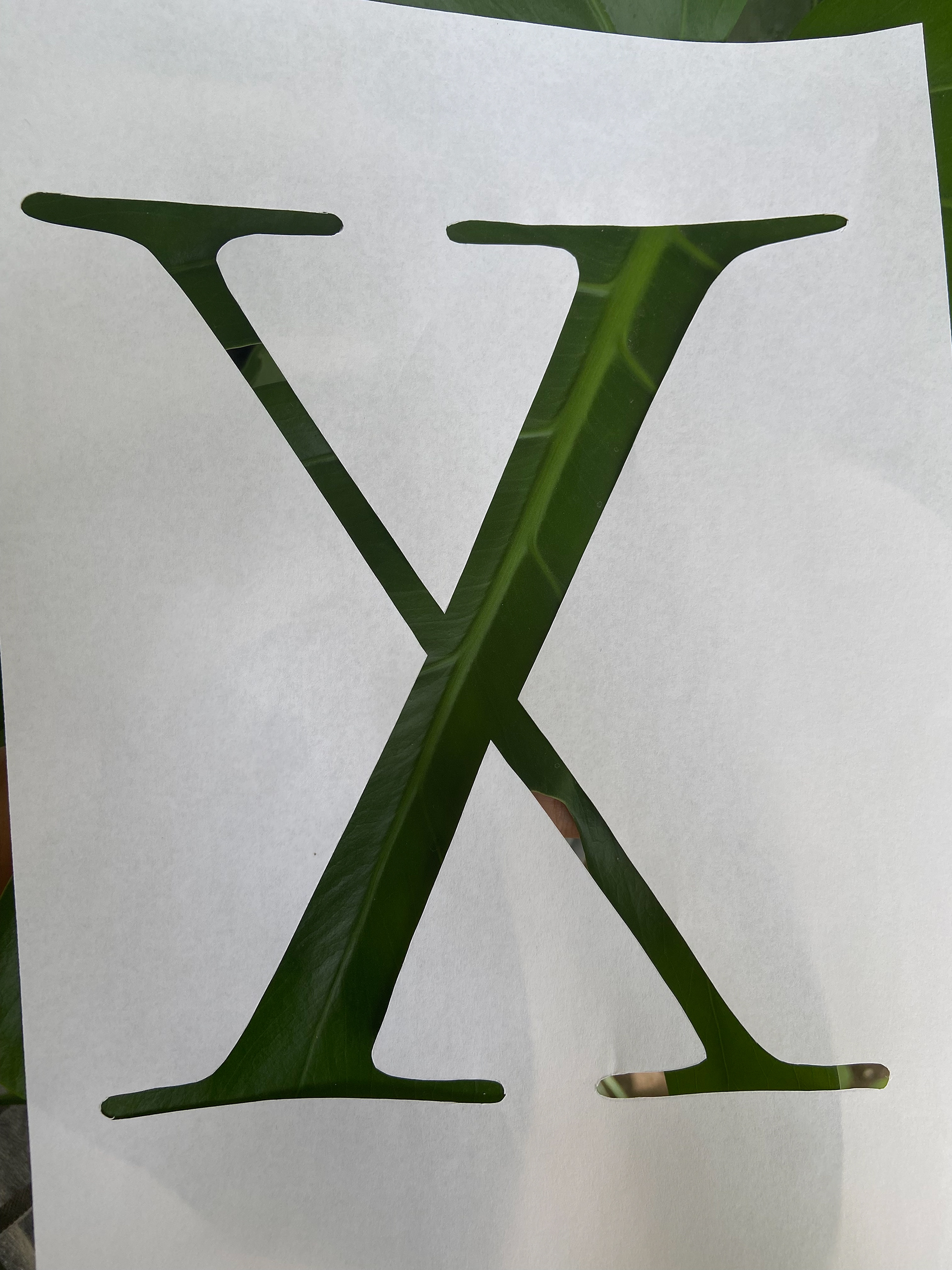
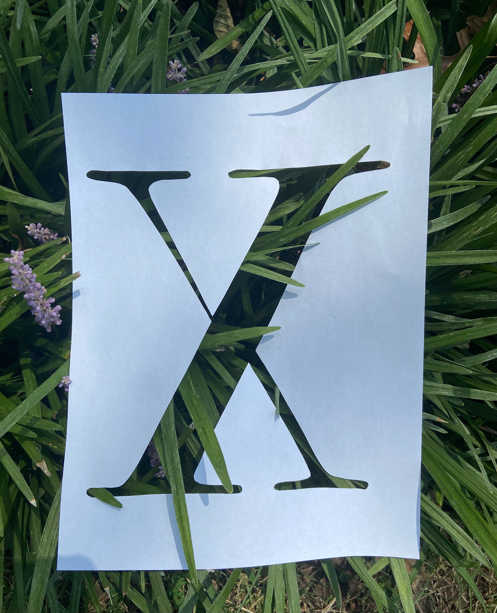
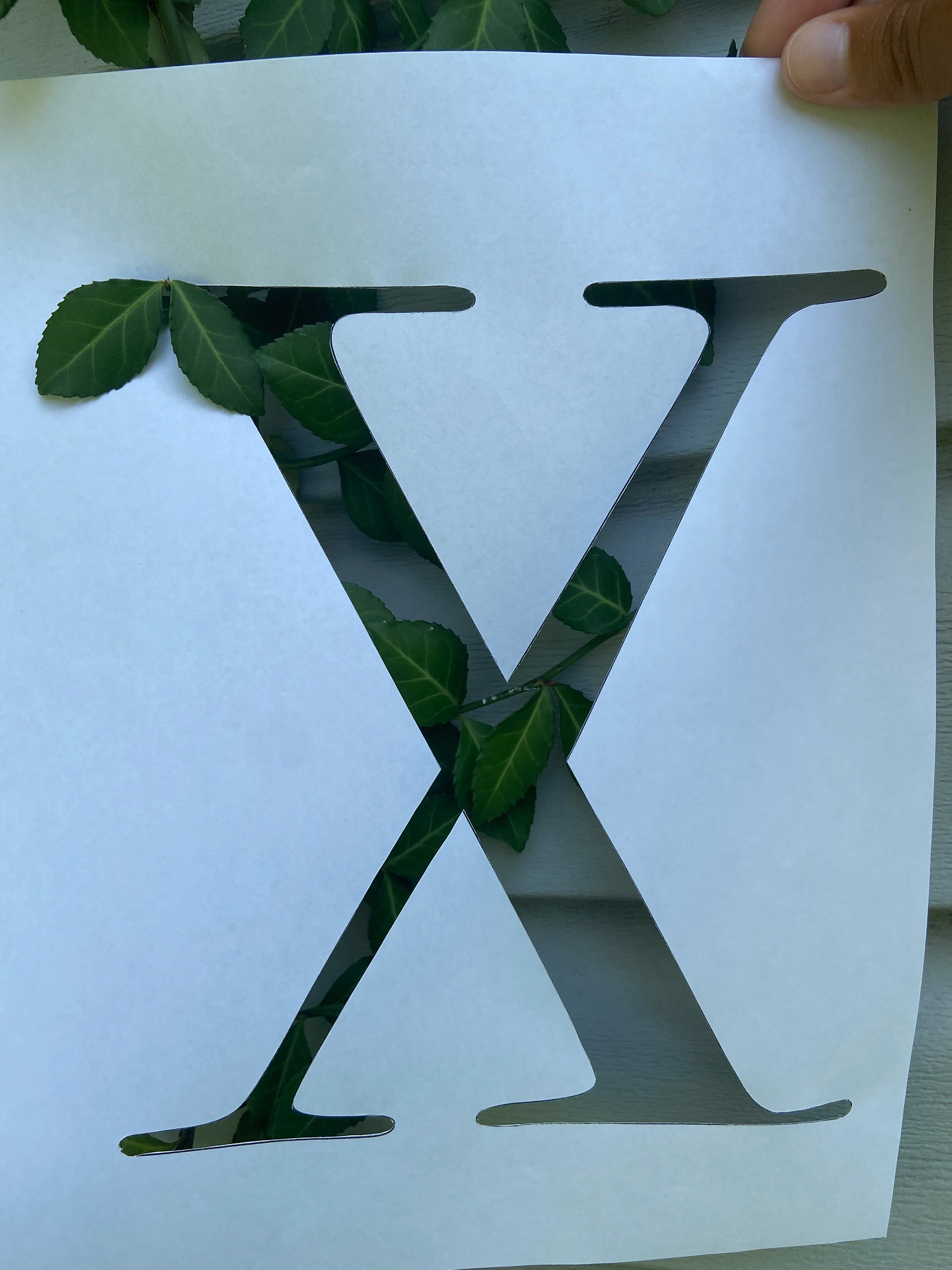
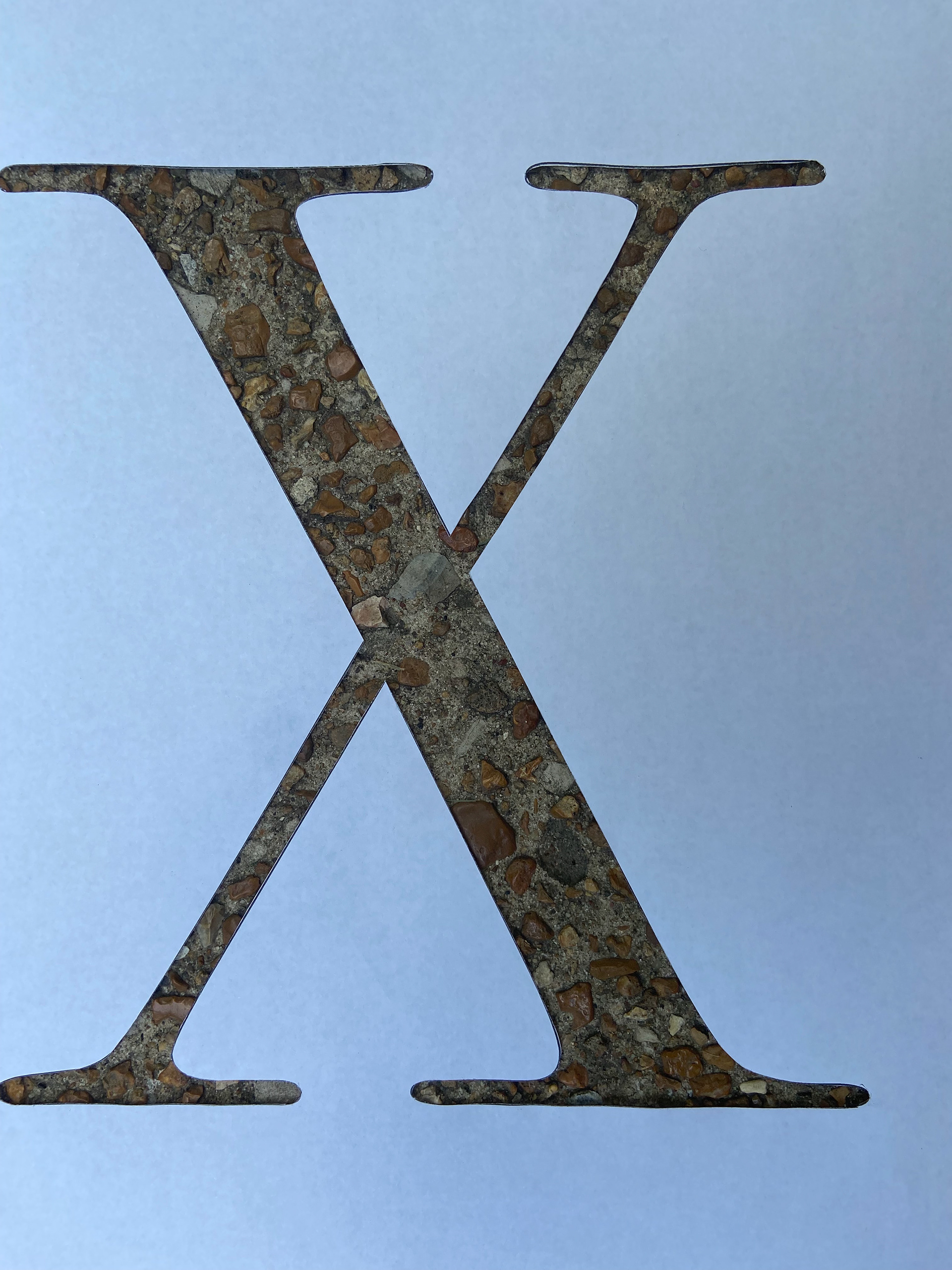
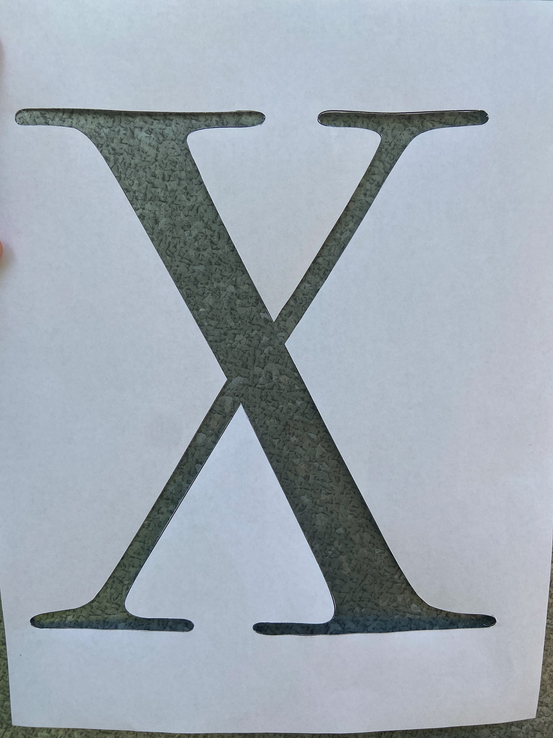
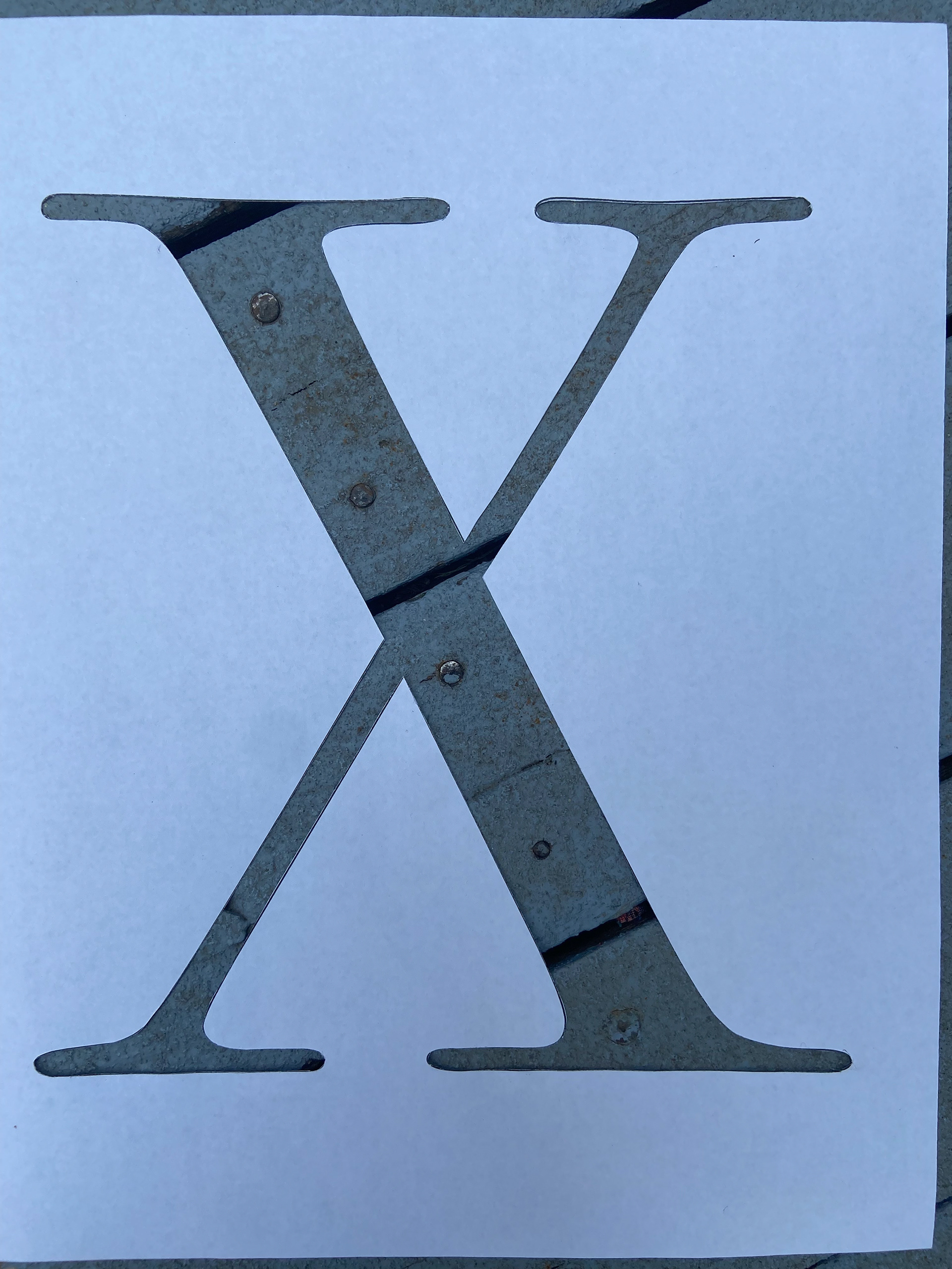
At the beginning of this project we were tasked to find an interesting texture and build a font around it. I chose the Bodoni typeface and went into Adobe Illustrator to turn letter's fill off and stroke only on. I proceeded to use an X-Acto Knife to carefully cut out each letter and take pictures of random things to find a texture I enjoyed.


After looking at a lot of textures I ended with these four and went from there to color correct ones that I enjoyed the most.
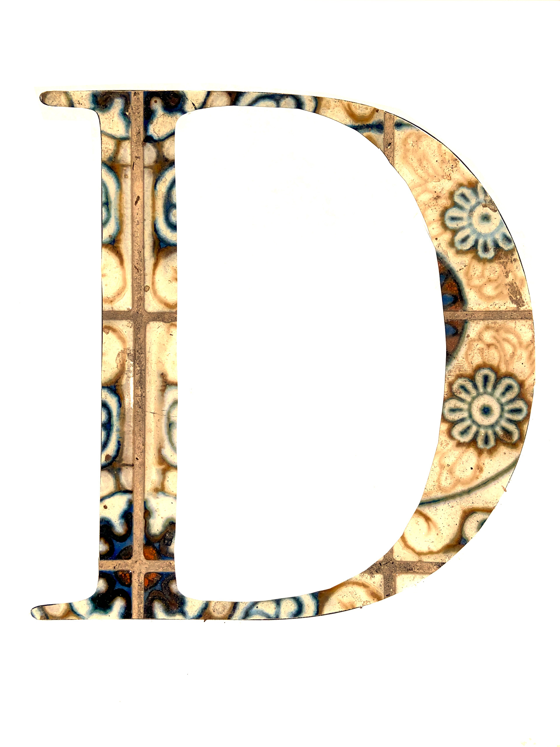
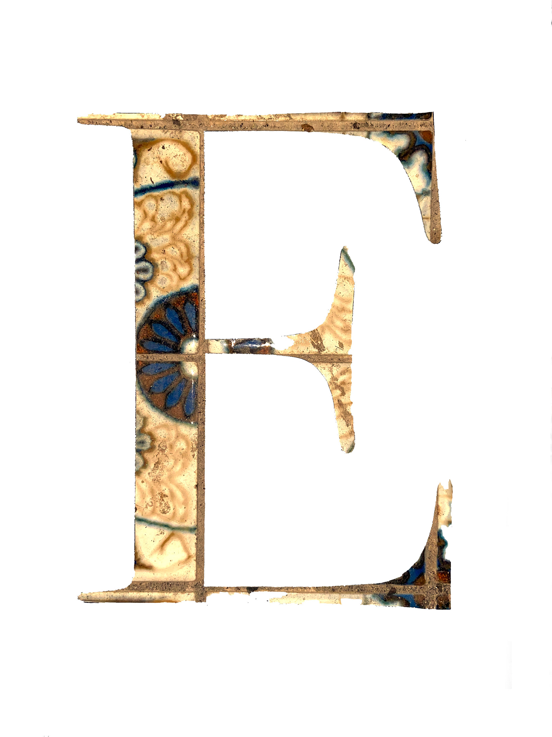
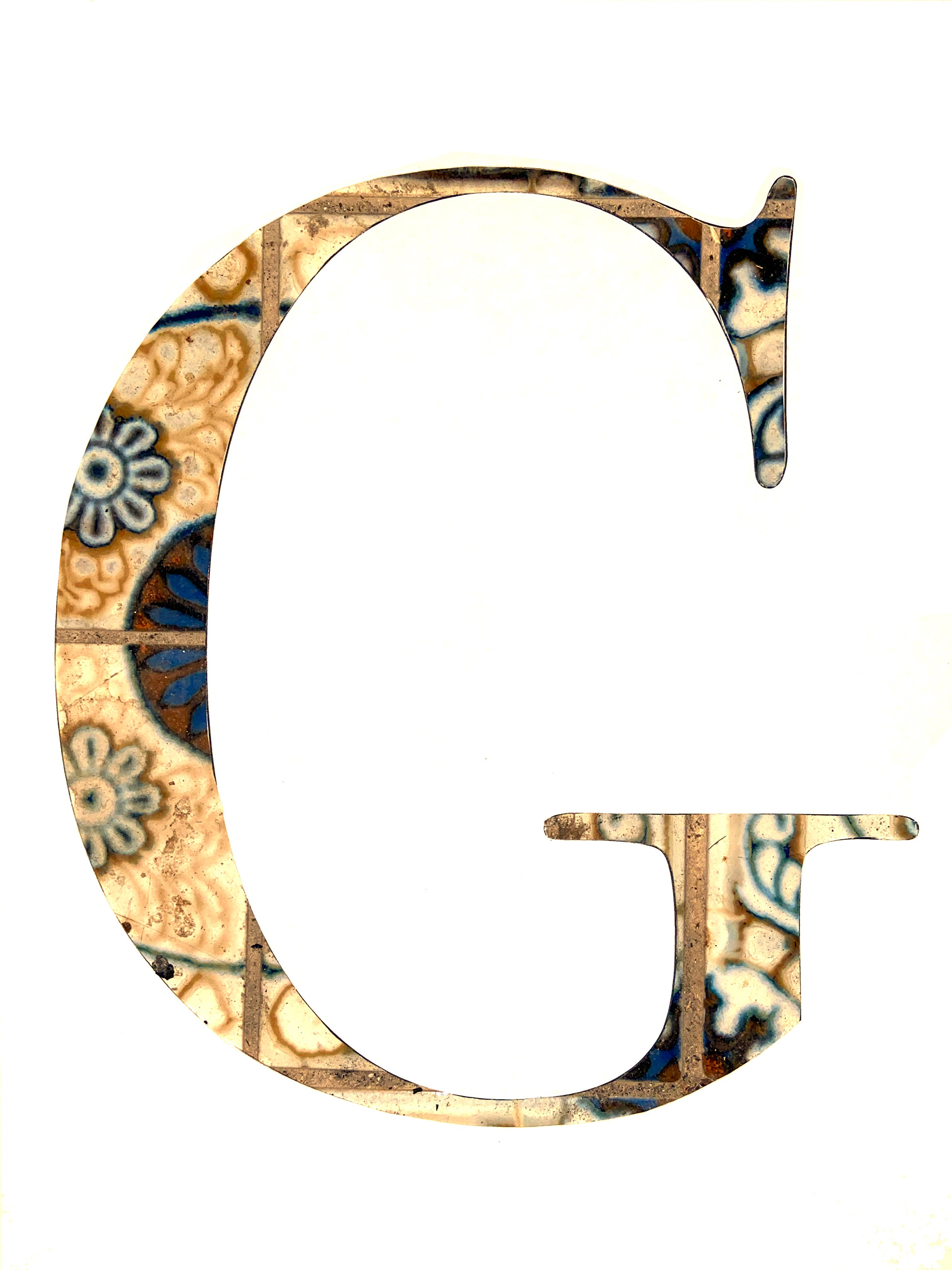
I edited the photos I took on my iPhone with Adobe Photoshop. Tuning the Channels and Levels I was finally able to make things work.
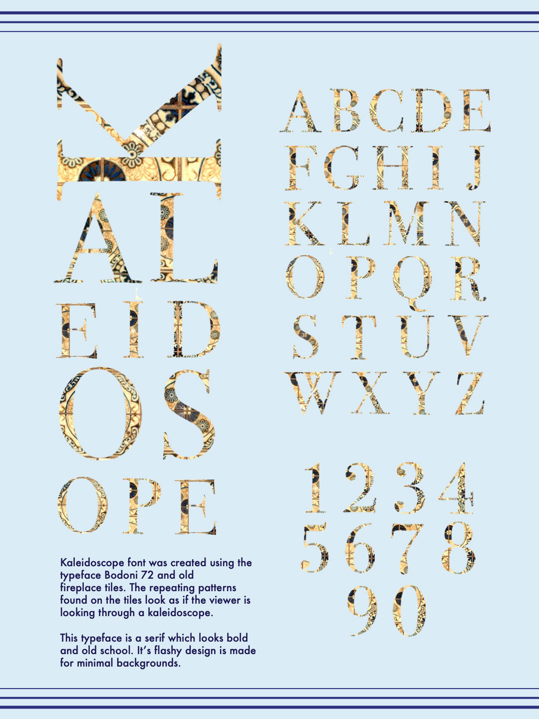
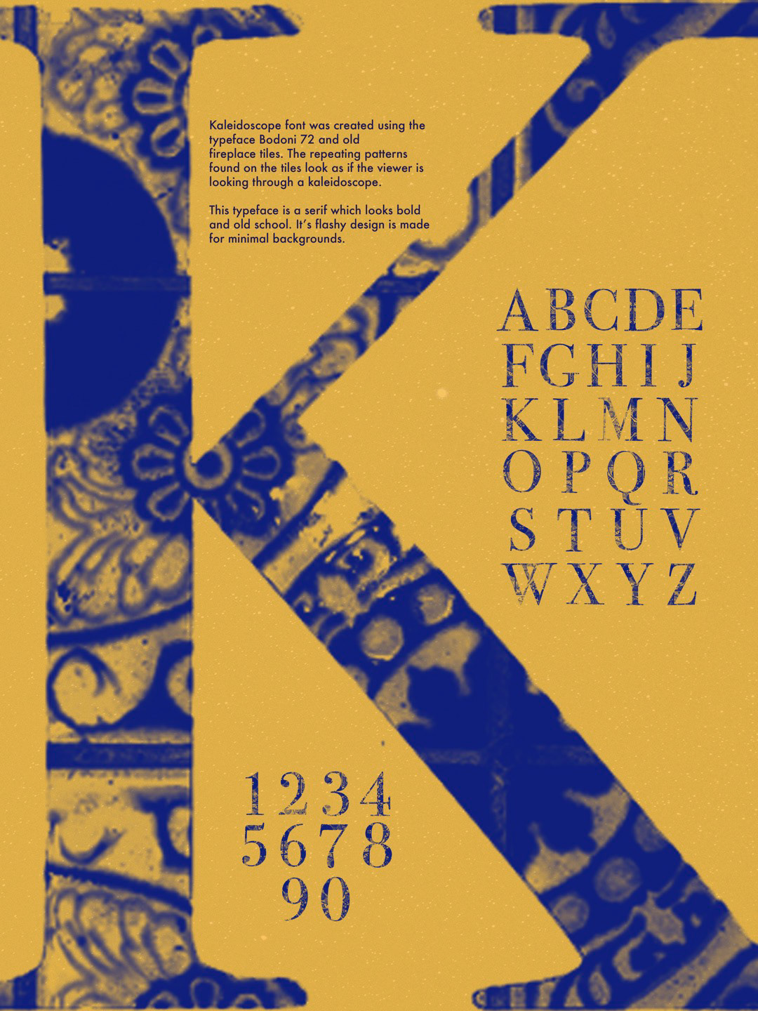
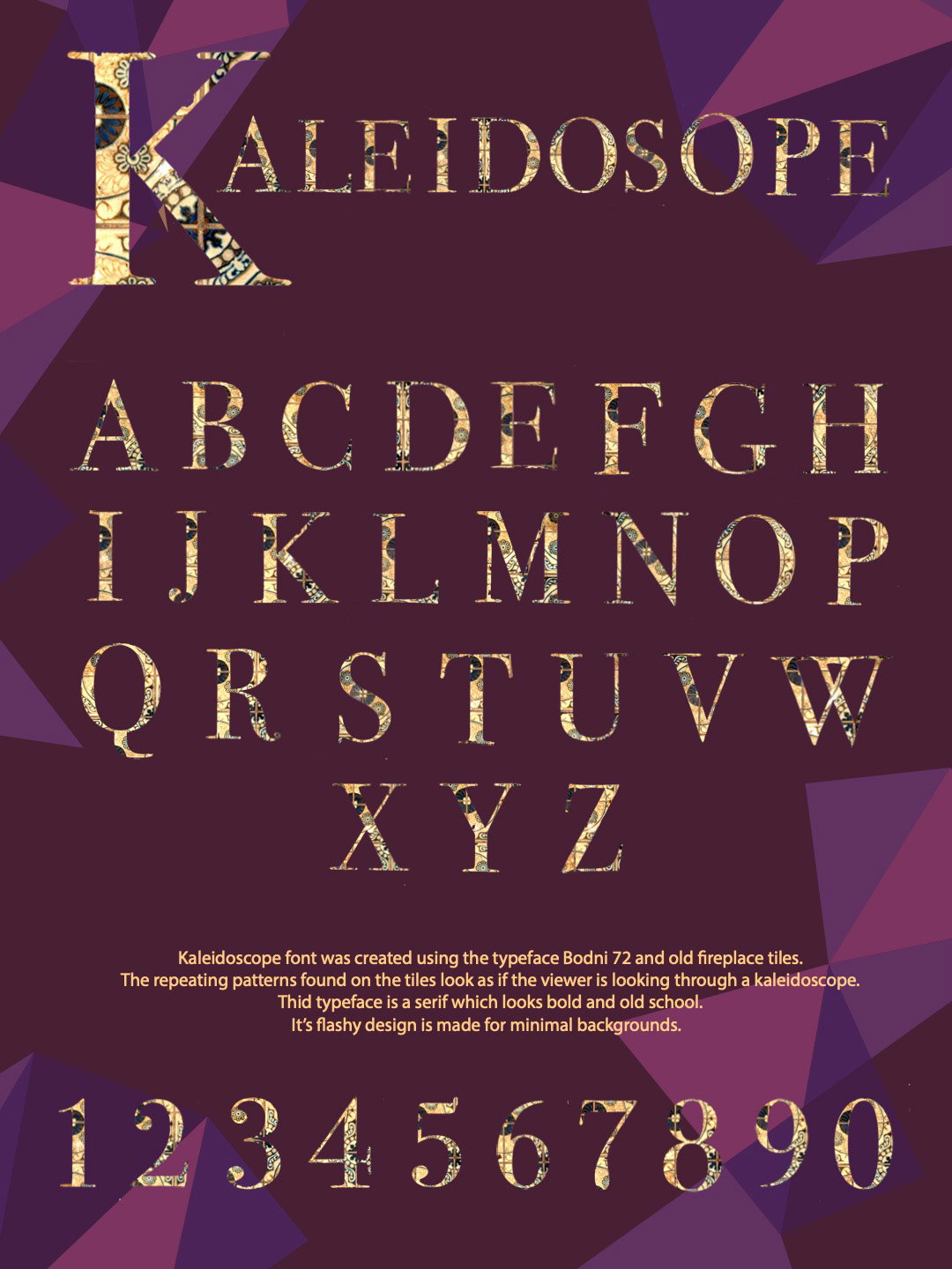
I went through a lot of trial and error. I wasn't feeling very inspired or happy with what I was doing and I felt really lost at this stage in the process. It wasn't until after a critique with these three images above did I finally start to have a an idea of where to go.
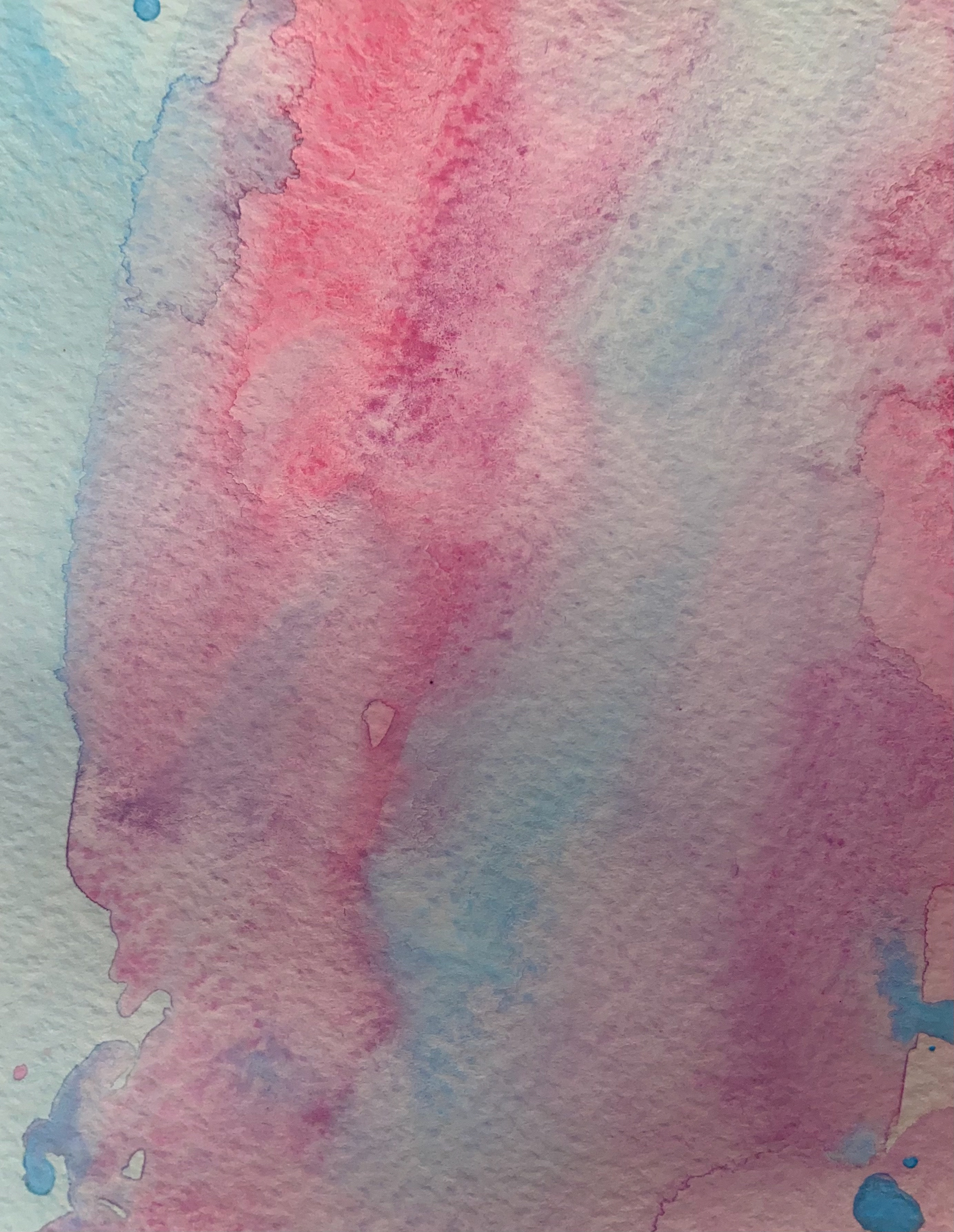
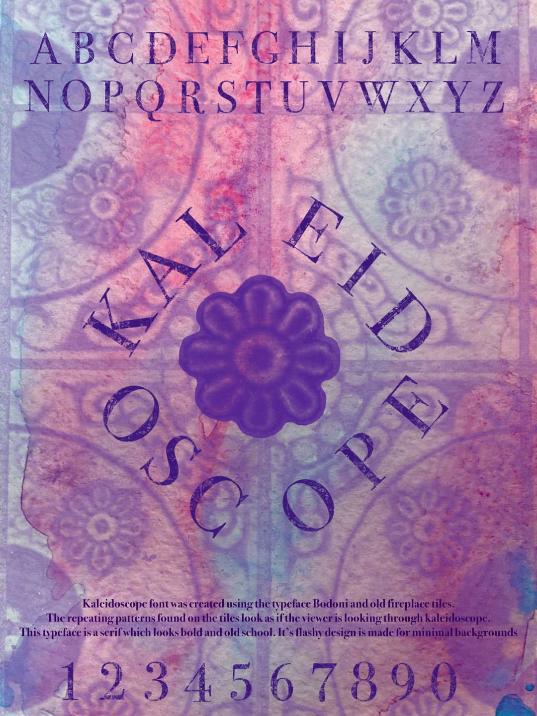

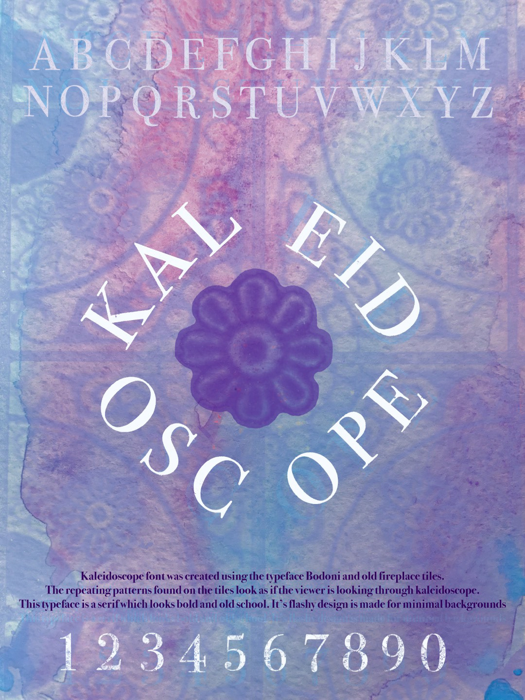
I decided to try out water color as my background. I really liked how it looked but my typeface got lost in it so I decided to scrap the watercolor idea. I still really love how it looks but viewer readability is always a main concern. I decided to really just let the typeface do all the talking and left the background white.
